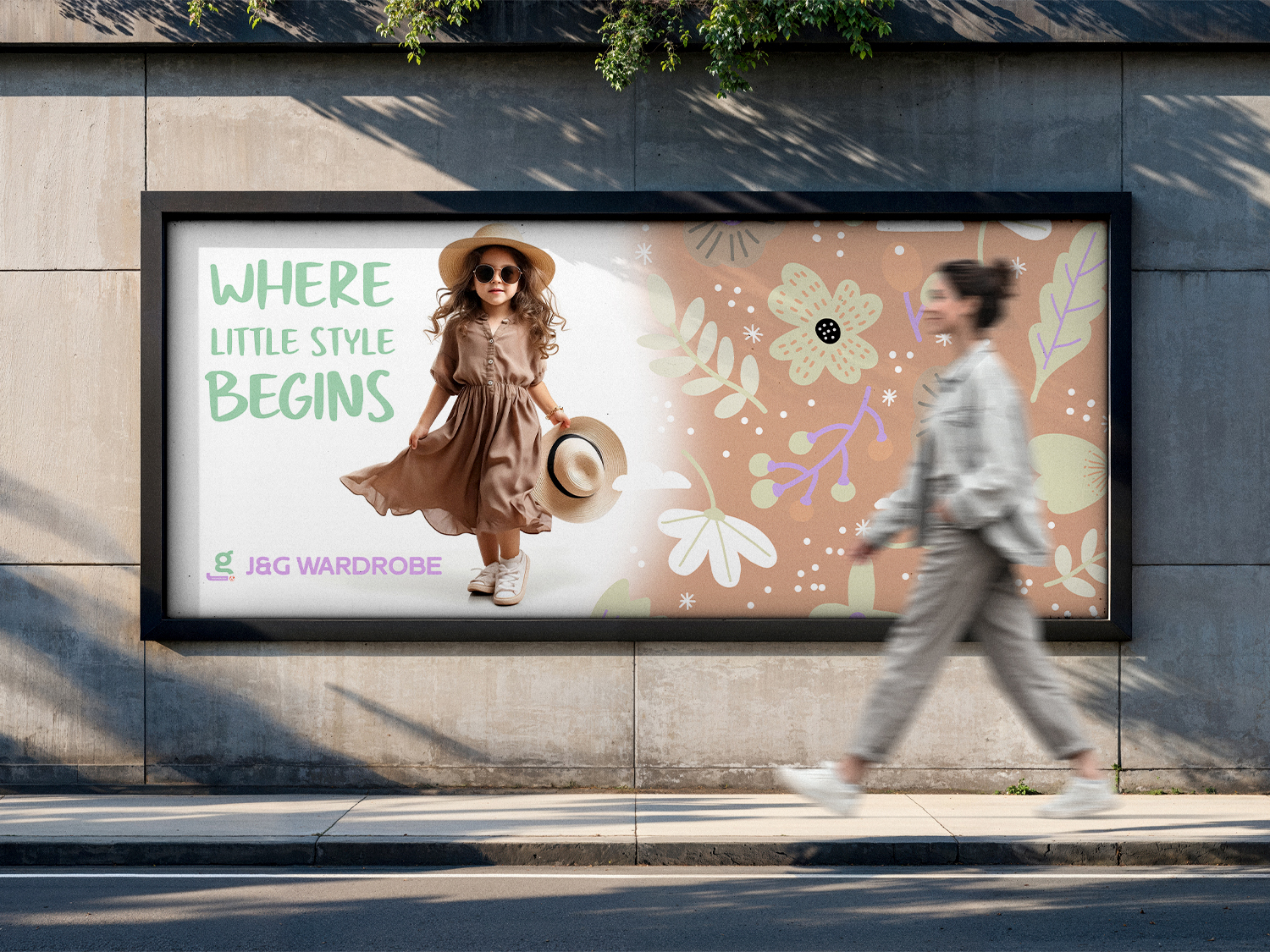
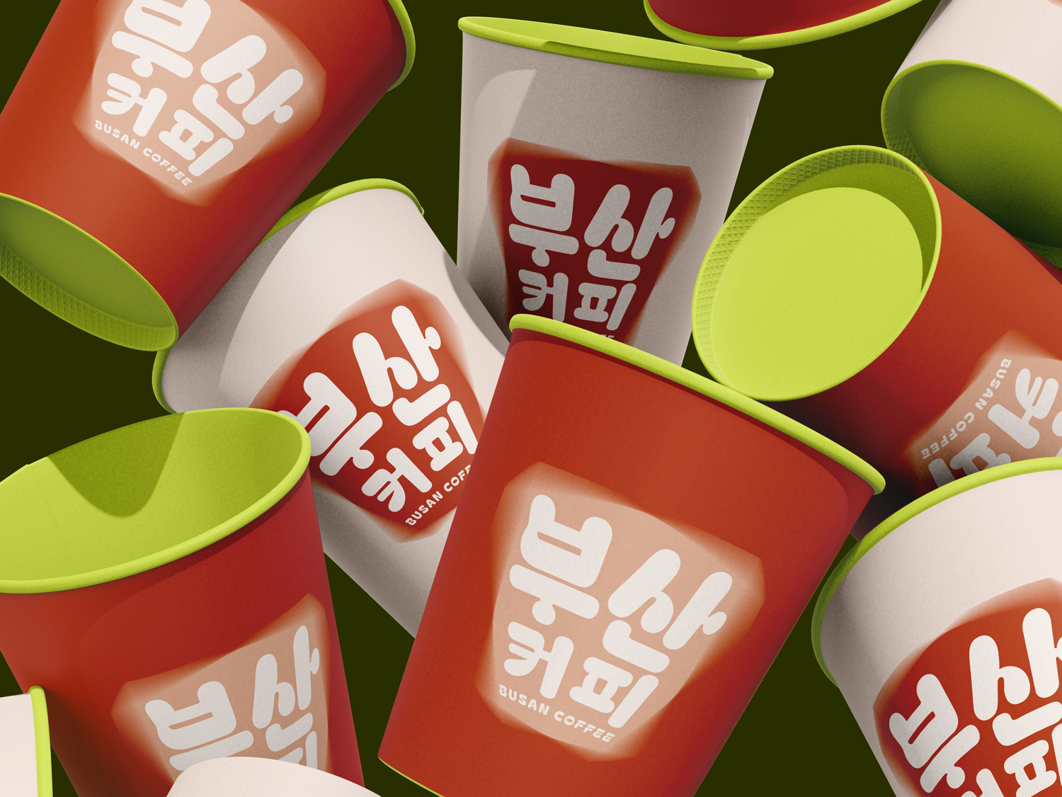
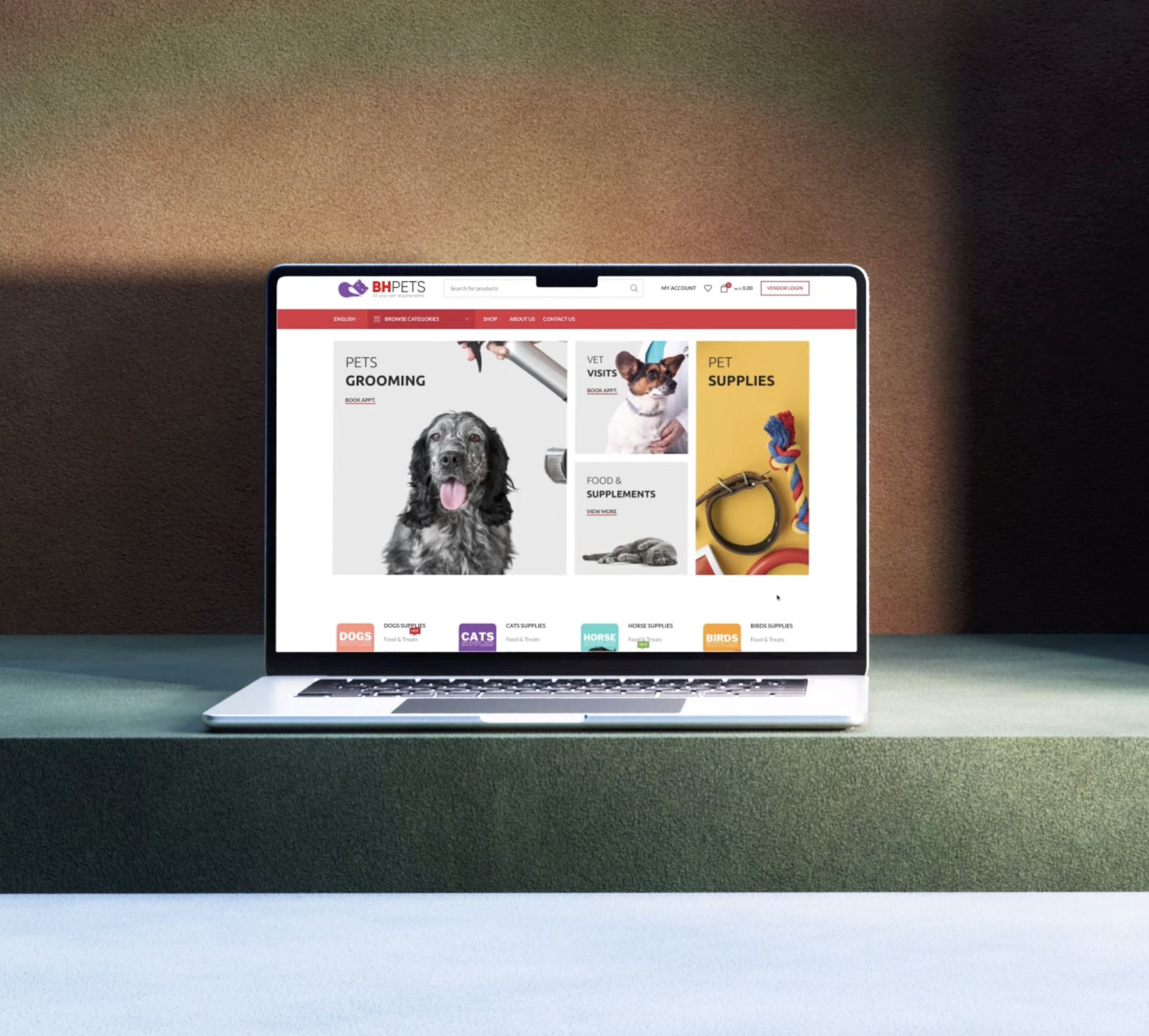
We crafted the logo, visual identity, and packaging system to reflect a balance between warmth and refinement — where rustic charm meets modern precision.
Distinctive, heritage-inspired logo design
Cohesive branding across all touchpoints
Packaging that feels tactile, premium, and memorable
A system built to scale across physical and digital experiences
This isn’t just design… it’s brand storytelling.
02.
🎯 The Challenge
Make it rustic. Keep it simple.
Design a logo that captures a warm, handcrafted rustic feel without falling into complexity or visual noise.
Authentic, countryside-inspired character
Clean, timeless execution
Easy to reproduce across packaging and print
Memorable without over-design
Rustic… refined to its purest form.
03.
💡 The Solution
Refined rustic. Designed to scale.
We translated rustic charm into a clean, structured identity system balancing warmth with clarity in every detail.
Simplified emblem with handcrafted character
Controlled typography for a timeless, premium feel
A flexible logo system that adapts across touchpoints
Packaging designed to elevate the everyday experience
Less noise. More meaning.
04.
🎨 Visual Direction
Refined. Warm. Timeless.
Primary color: Deep forest green → warmth, heritage, authenticity Secondary: Soft earthy tones → balance + natural premium feel
Typography: Classic serif with subtle handcrafted details Layouts: Structured compositions with organic imperfections
07.
🧲 At OX Design,
we don’t make things look good. We make them impossible to ignore.